The Canberra Craft Bookbinders Guild challenge for 2020 is to bind a copy of Ecce Mundus, the manifesto from Thomas Cobden-Sanderson of the Arts and Crafts Movement and the Doves Press and Doves Bindery. Printed sheets to bind are available from Vicki Woolley.
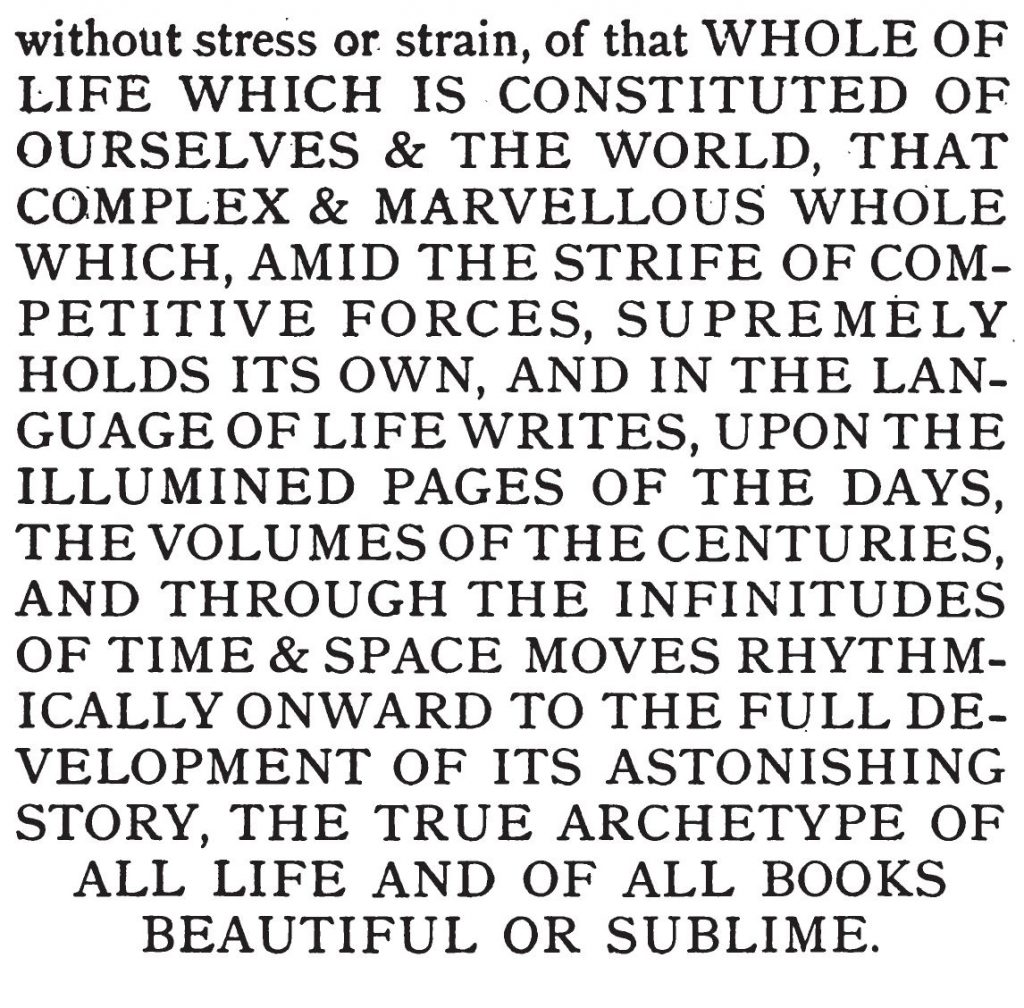
But there’s an unexpected blank page 44 in the text block, at the end of the second essay. It was absent from the online source when the book was extracted and printed for the Guild, and was apparently reinserted at the source some time in the succeeding months. There is no spare paper to print a new page, but it is possible to overprint your own sheet before binding – if you line things up correctly (and put the paper in the right way around). This took me a few attempts but it did work in the end, and the slightly different black and inkjet rather than laser printing is not apparent.
Here is a link to a PDF file and a Word version of the missing text as a picture. The page boundaries on these do not match the original printout (because I had trimmed my pages a bit before I noticed the missing problem), but I hope that you can print the one of these Word pages by itself, measure the offset of the desired cut marks against the original page, and reposition the image of the page in Word before you overprint onto the existing page. Or trim the original page to match the cut marks before overprinting, which seems a bit riskier. (I found that Word and Acrobat reader print landscape pages the opposite way up on my computer – so be wary).
The missing text looks like this (TJCS does tend to SHOUT a bit). It should be 7.5cm wide on the page.
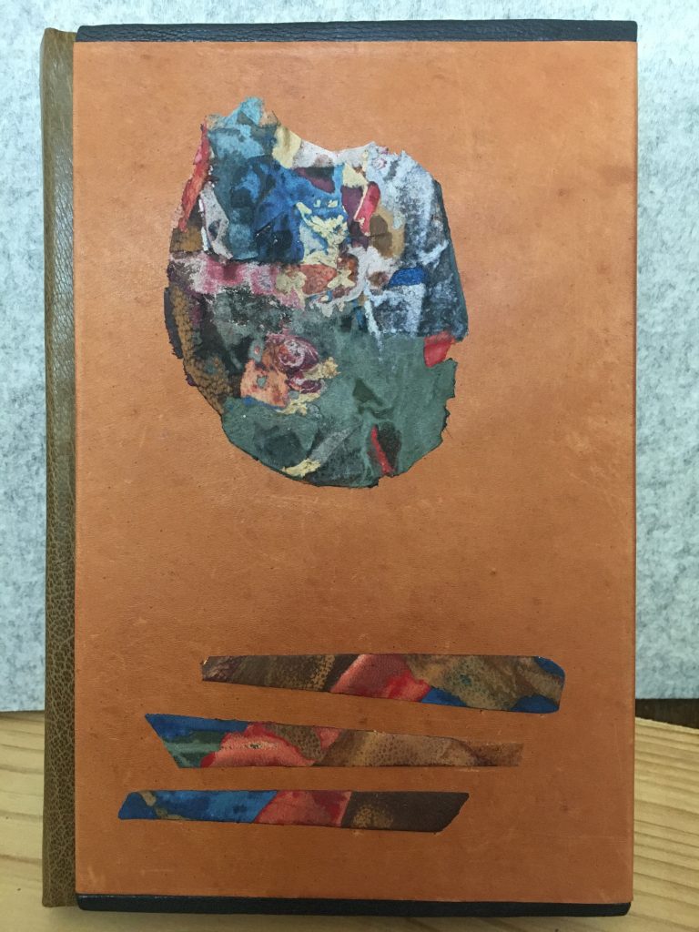
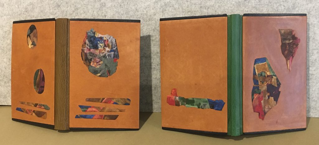
I used the rectangular panel of lacunose leather fragments on paper that I showed in a previous blog posting to make shaped onlay pieces for a pair of related books. The books are written in the 1930s by Olaf Stapledon: Last and First Men (published 1932, section sewn, paper cross grained – why?) and Last Men in London (part of a 1980s Penguin edition perfect binding, also cross grained but there’s more excuse with a perfect binding). The ‘Last Men’ are those of the 18th future species of humans, living on Neptune a hundred million years in the future. (Stapledon was a big long range thinker, following H.G. Wells and contemporary with Aldous Huxley’s Brave New World, an alternative vision of a future that is only 600 years ahead. He was a remarkably visionary, describing a world power struggle between China and USA in the 21st century… but that’s not the point here!). These books needed something relating to the themes of a very fractured future history and future evolved species of people who range from brutes to advanced brains.
Last and First Men simplified binding with lacunose – Chris Johnson March 2020Last & First Men and Last Men in London – Chris Johnson March-April 2020
The bindings are in simplified structure (that is, the spine is made on the book, the boards are covered separately and pasted onto the front and back). The leather spines are in complementary colours of the same type of fine, glossy goatskin. The board covers are plain soft kangaroo (very soft, it shows every mark) with a dark protective goatskin strip a few millimetres wide at the head and tail edges. The covers have multicolour onlays that are pieces made from the one lacunose panel.
I selected portions of the lacunose that suggested the themes in the books and cut them out along fragment boundaries, thinned them, sanding them back as far as I dared and then paring the edges. Sanding the back of the pieces with the front against a flat board reduced the uneven thickness. Some of the paper backing remains, so the shapes were stable and still in one piece. They still protrude a bit above the board leather, but the edges curve down to a smooth finish. The oval medallion pieces on the back were cut with a large oval craft punch and then thinned out to soften the edges.
The forms of the pieces were not planned when I was making the lacunose panel, but I chose them from what emerged. This method of design works better for me than trying to design too much in advance. (I do the same with paste paper, making it with broad strokes then finding the best bits afterwards.) I spent a couple of days juggling layouts with a larger set of prepared pieces, leaving them overnight and taking another look in the morning until it felt right. Then I thought I could do more lacunose pieces on the spines – but sanity said to me NO! (1) the spines are too narrow, and (2) less is enough!
Spine titles? – desirable for these books and for this design, maybe in gold lettering, sometime in the future. I did stamp the foot of the spines in blind with the publication date of each book (doing this in gold is a neat convention from the end of the 19th century) and that could be done too – when I have had more practice gold tooling.